Introducing visual testing: give coding agents a measurement, not a screenshot
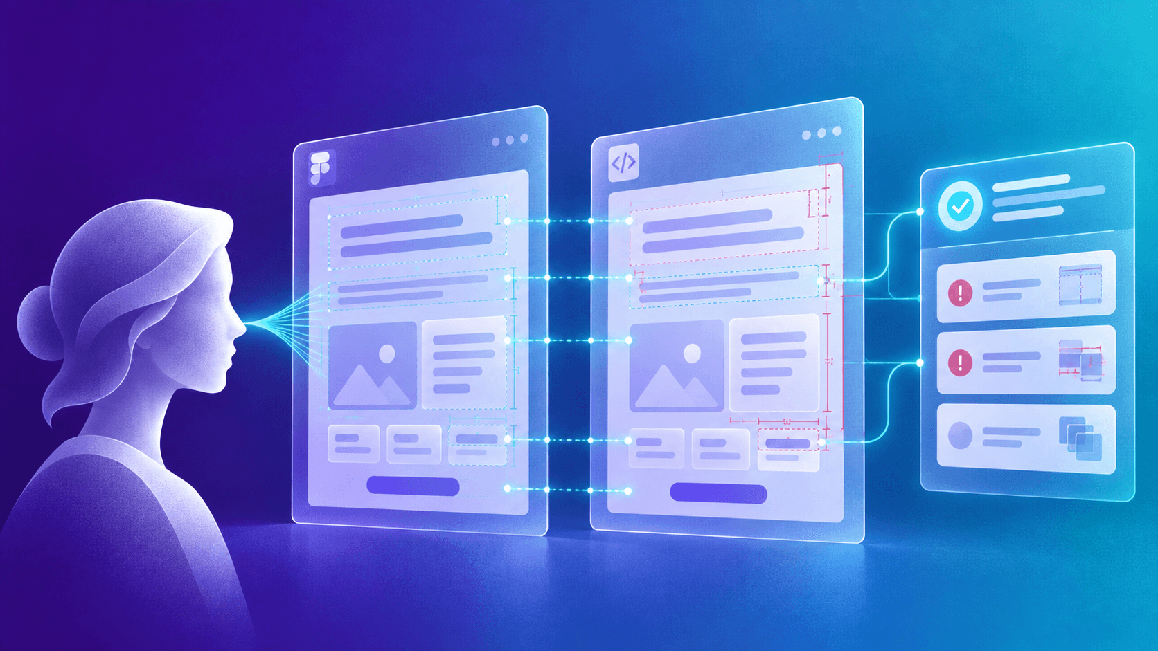
Visual testing checks a built page against its Figma frame, text node by text node, and gives coding agents a pass or fail instead of a screenshot to squint at.
01
Introducing visual testing: give coding agents a measurement, not a screenshot
A coding agent can build a page from a Figma frame in minutes, take a screenshot and declare it a match. But that last step can go wrong, just as it did before agents arrived: checking the build against the design has never had a clear owner. Visual testing, a new Testuvion feature we are making available now, replaces eyeballing with measurement. It checks each text node and hairline against the Figma frame and returns a verdict with ranked findings. An agent can call it over MCP, fix what it reports and repeat until the page matches.
02
The short version
The usual check is a person, or an agent, looking at a screenshot. In a 2026 benchmark, the best of thirteen vision models found 40.7% of single-property changes on rendered web pages [E5].
Visual testing measures instead of looking: text nodes, hairlines and section pixels against a Figma frame, with separate allowances for text, image and layout differences. A tester reviews a measured verdict instead of judging visual fidelity by eye.
An agent can loop on it: run a check over MCP, fix the differences and track which findings are fixed, new or still open, including on localhost. The same check runs in the app, on a schedule or in CI.
AI explains the result: it groups differences by cause and recommends fixing the page, changing the design or asking a person to decide.
Coding agents rebuilt our website against the in-house check that visual testing grew out of. The human time came to under a man-day, not counting building that check.
03
Checking the build against the design was nobody's job, and now an agent does the build
Ask who owns the design check, and every role has a good reason why it is not theirs.
Testers test behaviour. The foundation syllabus of the ISTQB lists testing knowledge, attention to detail, communication, analytical thinking, and technical and domain knowledge [E3]. Design expertise is not on that list. Spotting a heading one weight too heavy, or a divider a shade too light, takes a designer's eye and a front-end developer's knowledge. One practitioner puts it plainly: "We have QA folks too, but they look for bugs or unexpected behaviors vs design feedback" [E10].
So the check falls to the people who notice. Designers open the page beside Figma, screenshot the differences and annotate them, release after release. A forum reply called it "the designer's second job nobody asked for" [E14], and a startup designer put it simply: "I have to do front-end QA myself" [E10]. Designers see the differences, but they are not testers, and their time is rarely planned as if they were. The check happens late, by eye, when someone has the hours.
Developers sit in the middle. In my experience they do most of the iterating: nudge the padding, reload, compare, nudge it again, with tools that rarely tell them how far off they still are. In Figma's survey of 943 designers and front-end developers, 91% of developers and 92% of designers saw room for improvement in handoff [E12].
Now an agent writes much of that code and inherits the same gap. It fills it by looking. A designer on a team using Claude Code and the Figma MCP wrote: "Design QA was already a challenge before AI, but now it feels 10x worse" [E15].
04
A screenshot answers a different question, for a person or an agent
A screenshot test captures a page and compares later captures with an approved image, pixel by pixel. It tells you whether the page changed, not whether it matches the design, and someone still approves the first screenshot by looking at it.
It is also noisier than it sounds. Playwright's own documentation warns that "browser rendering can vary based on the host OS, version, settings, hardware, power source (battery vs. power adapter), headless mode, and other factors" [E1], so the same page needs a separate baseline per browser and platform [E2]. Practitioners describe where that leads: one team "drowning in false-positives" [E16], and an engineer recalling that the most common result of a failing test was that "someone would update the expected file/image so it would pass" [E16]. A red diff approved to green by habit has stopped testing anything.
For coding agents, Anthropic recommends a similar loop for UI work: "take a screenshot of the result and compare it to the original. list differences and fix them" [E7]. We used it ourselves. It works, up to a point. But seriously: after decades of testing tooling and years of heavy investment in AI, is this really where the state of the art should stop? Show a model two screenshots and ask whether they look the same? That is not much of a verification loop. It is an opinion. We should expect better.
DiffSpot shows why. In this 2026 benchmark, thirteen frontier vision models compared two renders of a web page with one CSS property of one element changed, a line height for instance. The best found 40.7% of the real changes, and every model stayed below 23% on the hardest tier [E5]. Comparing a page with its Figma frame means two different renderers and many differences at once. Nobody we know of has benchmarked that task directly; DiffSpot is the closest evidence we found.
Practitioners report the same failure mode. One developer showed Claude Code a broken interface with cut-off text and overlapping elements, and it replied: "Perfect! The screenshot shows that XYZ is working" [E11]. An agency reports that the first generation "gets ~80% right but we always end up spending 1-2 hours per component eyeballing differences and describing fixes back to the AI" [E13]. The checking fell back to a person.
The same guide names what is missing: "Give Claude something that produces a pass or fail, and the loop closes on its own" [E7]. For "does this page match the design", visual testing is that pass or fail.
05
Visual testing measures every text node, every hairline and every section against the Figma frame
Our earlier website checks asserted individual values: gaps, padding, colours and type. They passed pages with visible defects. Gutters nobody had written down went unchecked, and a tolerance meant for rounding accepted #fafafa where Figma drew #ffffff. Every fix became an argument over screenshots and over whether the check was right.
Visual testing starts from the design file instead. It pins one version of the Figma frame, so the reference cannot move during a run. It captures the page twice, and if the two captures differ, the page has not settled and the run fails instead of measuring noise. Then three checks run over that one capture, each answering one question.
Raster: does every section have the design's pixels?
Each Figma section is compared with the matching part of the page. Differing pixels are grouped and classified by what lies beneath them: text, an image or video, or plain layout. Each has its own allowance: 8 differing pixels fail a layout group, an image group needs 64, and text is judged against the ink it covers.
Rules: is every line where the design draws it?
Every hairline in the Figma frame, a border, a divider, an underline, must exist on the page in the same place, at the same thickness and in the same colour. The page must not draw any line the design does not.
Text: is every piece of text set the way it was designed?
Every text node in the frame is matched to the text on the page and compared on copy, box, font family, size, weight, line height, letter spacing, colour, alignment, line count and explicit line breaks. This is where "the heading looks a bit heavy" becomes a finding with the designed weight, the rendered weight and the element it belongs to.
The measurement produces the verdict. The AI reads it afterwards and cannot change it.
Pixel-perfect cannot mean identical pixels. In our comparisons, Figma and Chromium placed the same glyphs about a third of a pixel apart per word, and they smooth edges differently. Every check therefore has a tolerance, kept as tight as the renderers allow: half a pixel for line position, a tenth of a pixel for font size. We calibrated against seventeen defects injected into our own pages, among them a smaller gutter, a deleted hairline, a heavier heading and a hidden word, and used the results to tune the checks. Two of the seventeen, a swapped surface colour and a colour two steps off, are still not reliably caught, and we record them as blind spots. A team can widen seven geometric tolerances up to fixed caps; colour tolerances cannot be widened.
Some differences are right: placeholder copy becomes real data, or a designer agrees that a component stays as built. A team can approve one difference, or a rule for a class of findings on one screen or across the check, and every approval needs a reason. The verdict then reads PASS-WITH-EXCEPTIONS, so an approval is never mistaken for a match.
Three hard problems, and how the check handles them
One element too tall moves everything below it. Each section is compared at its own position on the page, so a hero 8 pixels taller does not smear every pixel below it. The sections it pushes down still report the shift, and the AI analysis then names the shared cause.
An image is not text, and not the background either. A difference under an image, a video or an SVG is judged as media, with its own allowance, and artwork is left out when the check reads the page's colour scheme, so a light page with dark artwork on it still reads as a light page.
The browser does not set type the way Figma does. For text that Figma sizes to its content, the compared box is rebuilt from the ink actually painted. For fixed-width text, the width check allows a narrower rendered box when the line count is unchanged; a wider box or a different line count still fails.
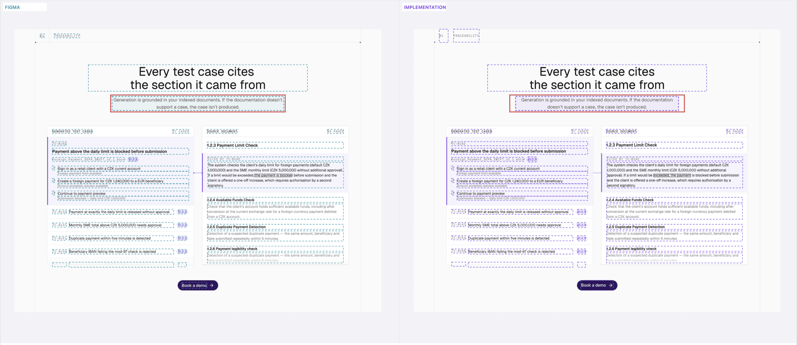
The design on the left, the page on the right, with every text node and line the check matched outlined. The red box marks one finding on that paragraph: two lines in both versions, but the text wraps at a different word.
06
A pass or fail an agent can loop on, first tried on our own website
An agent does not need a better pair of eyes. It needs ground truth from outside its own judgement. Anthropic's agent guidance calls that "crucial" at every step [E17], research on text reasoning finds models struggle to correct their own work without external feedback and do well with reliable feedback [E20][E21], and without such a check, as the Claude Code guide puts it, "'looks done' is the only signal available" [E19].
Anthropic also describes agents confidently praising their own work, a problem particularly pronounced in subjective tasks such as design [E18]. They meant aesthetic quality. Whether a page matches the Figma frame it was built from is a different problem, and it can be measured. Visual testing gives agents that check over MCP.
The loop is simple. Run a check on a screen and get the verdict, the top findings and what changed since the previous run, in one answer. Read further down the ranked list when needed. After each fix, ask which findings are fixed, new or remaining. Change the padding and break the line height, and the agent sees one finding fixed and another introduced, instead of a screenshot that looks about the same.
It runs where the developer works. The Testuvion connector, a small program on the developer's laptop, opens the local dev server to the check, so the agent can check a page before anything is committed. A run against a shared environment can be certified: every check ran in full, on the full reference, with every section mapped. A localhost run never is, because nobody else can reproduce a capture of one laptop's dev server. It is the working answer; the shared environment gives the certified one.
This is how our own website was rebuilt. Coding agents implemented the redesign page by page, checked each page against its Figma frame with the harness that visual testing grew out of, fixed what it reported and ran it again. The human time from the first page to the last came to under one man-day, on the site the checks had been calibrated on. That figure does not include building the harness, which was developed alongside the redesign and has been refined since; that was the real engineering.
When the agents were done, all ten comparisons, eight pages at 1440 pixels plus the homepage at 320 and 1920, reported no open differences. The deviations that remained had been approved one by one, each with a reason, and no tolerance had been relaxed to get there. Changes to the site now go through the shipped feature, over the same MCP tools an agent in any team would call.
07
Sometimes the page is right and the design is wrong
A comparison usually assumes one side is the truth. A screenshot test trusts the old screenshot; a designer with an overlay trusts the Figma file. Visual testing reports a difference without deciding in advance which side caused it, and that matters most to the person who drew the design.
During our redesign, the article page had 78 open findings. They looked like 78 problems in the code, but they were one 13-pixel cascade caused by two defects in the Figma file: a citation whose line height did not inherit from its paragraph, and a run-in heading that wrapped one line early. The homepage footer carried an 8-pixel instance override that the shared footer must not inherit. All three became requests to the designer, not changes to the code. The pricing page's first defect went the same way: fixed in the design and closed by moving the check to the new version of the file, with no change to the code.
Those causes were found by people, before the AI analysis existed. The analysis can now recommend the same outcome. For each group of findings it recommends one of three things: fix the page, change the design, or let a person decide. In one run it flagged a footer where the page carried "All rights reserved." and the design did not, and handed it back to a human: if the line belongs there, the design should change; if not, the page text should be shorter. That is a product decision, and the tool says so instead of guessing.
For a designer, this changes the conversation. "It looks a bit off" becomes something like "the design sets this heading one weight lighter than the page renders it", and sometimes "the design says something we no longer want". Their frame is checked node by node on every run, by the same rules each time, without anyone drawing red arrows on screenshots. When the design moves on, the check moves with it: approvals over unchanged design carry over, and only those whose design changed ask to be approved again.
08
The AI explains; the measurement decides
A list of findings is exact, and it can still be hard to read. One run of our homepage, against a later revision of its design and the same run as the footer example above, reported 198 open differences. Nobody fixes 198 things. Somebody first has to work out how many problems that actually is.
The AI does that reading. A vision model receives the ranked findings and crops of the design, the page and the difference for the most important ones, and returns a summary with the findings grouped by cause. In that run it examined the most important findings in detail and sorted them into seven groups.
Two were layout problems: the hero was 8 pixels too tall, and a comparison table's text wrapped onto a second line, adding 28 pixels. A third group captured their combined effect: every section below them, and the page height, shifted by 36 pixels, and the AI's summary put most of the 198 findings down to those two causes. A fourth was about capture conditions: a cookie banner covered a row of cards, so their text read as missing and the banner's as extra. The remaining three covered navigation spacing and two footer differences. For that run, the measurement took about a minute and forty seconds and the analysis cost about thirty-two cents.
The same analysis also got one wrong. It recommended adding a footer link that the design shows and the page leaves out. But the linked page is intentionally hidden, and the analysis did not have that product context.
That is why the split is strict. The measurement produces every finding and the verdict, and the AI has no way to change either: it never edits a finding, moves a run from fail to pass or touches certification. Everything it writes is labelled as AI. Its job is to shorten the reading, not to replace the check. A team can turn it off per check; otherwise it runs after every finished run, scheduled and CI runs included.
09
What visual testing adds to the existing workflow
None of this starts from nothing. Screenshot tests catch that a page changed. Overlays let a designer lay the design over the page and look. Some tools read properties from a Figma frame and compare them with the page element by element, and leave the verdict to whoever runs them. Some accept a Figma frame as their reference and compare it with the page as an image. And several visual testing services now expose their results over MCP, so an agent can read them. Each of these solves a real part of the problem, and teams use them for good reasons.
Visual testing puts the parts in one place: the design file as the reference; text, lines and pixels each measured against it; tolerances and approvals a team can govern; a loop an agent can run on a developer's machine; and an explanation that can recommend changing either the page or the design. A check an agent can trust has to fail for the right reason, make a pass mean something, and run where the agent meets it before anyone else does.
10
What it does not do yet, and how to start
Visual testing is a new feature, and we are making it available now. Figma is its only design source today. Other sources, such as Claude Design, are planned, and the checks are designed so that a new source adds a reference, not a new way of measuring.
Starting takes a Figma link. You paste it, choose whether you are checking pages or Storybook components, pick the frames, and name the environment and the paths they live at. Sections of each frame are matched to the page automatically wherever the match is unambiguous, and the rest wait for a person to confirm. Pages behind a sign-in can be checked with the sign-in steps your project's existing tests already use. From then on the same check runs from the Testuvion app, on a schedule, in CI, or from a coding agent over MCP, including on a developer's own machine through the connector.
Developers get an agent that stops at a measured pass, not at "looks done". Testers review findings instead of judging visual fidelity by eye. Designers get their frame checked on every run, with evidence for changing either the code or the design. Delivery teams get the design check inside CI and the developer's loop, not only before a release.
11
Models used, and how this was written
This text was drafted with AI assistance from a list of checked sources, and edited and approved by its author. Every number traces to a checked source: external claims to the published works below, our own figures to our runs between 16 and 30 September 2026, and the redesign's human time to the author's own account. The AI analysis in the examples ran on Claude Sonnet 5. The illustration at the top of the article was generated with an OpenAI GPT image model. The survey of other tools was made on 1 October 2026.
CTA
Deliver pixel-perfect implementations for a fraction of the cost
Give your testers, developers and designers back the hours they spend comparing screenshots, so they can focus on the work that matters.
How we built a voice interviewer to capture project knowledge that never reaches the documentation, and the three constraints it took to make it safe inside a production application: user-scoped authorization, an eighteen-tool read-only surface, and tools that report only outcomes the interface actually produced.
Human oversight of AI mostly fails, and the research says why: accountability alone does not make people check, and showing the reasoning is contested. What is left is the cost of verifying and whether the decision can be skipped. This is the case for treating a tester's approval as the moment a generated test case acquires standing, not as a safety net bolted on at the end.